Aesthetic
How the look is actually built
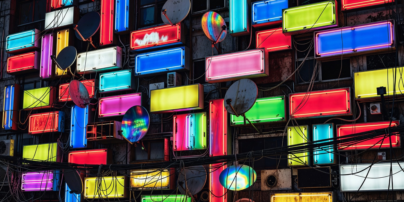
Neon and rain are the shorthand, and the shorthand is misleading. What makes a frame read as cyberpunk is layering — old fabric with new equipment strapped to it, signage competing for the same wall, infrastructure exposed where it should be hidden. Get the layering right and you can drop the pink lighting entirely.
Retrofit, not renovation
The single most transferable idea in the genre's visual language is the retrofit: nothing is demolished, everything is added to. Cabling runs along the outside of buildings. Air-handling equipment is bolted to façades that were never designed to carry it. Advertising panels are fixed over windows. This is why cyberpunk cities feel plausible in a way that clean utopian futures do not — real cities accumulate rather than reset, and the accumulation records who had money and when.
The corollary is that the future arrives unevenly. A stall selling street food from a modified cart sits under a projection surface worth more than the building. That contrast is the theme rendered as set dressing, and it is why a wide establishing shot in this genre usually contains at least three technological eras at once.
Where the density comes from
The visual template draws heavily on real high-density Asian urbanism: the stacked vertical signage of Hong Kong's main thoroughfares, the layered lanes and after-dark colour of Tokyo's Shinjuku and Kabukichō, and the extreme self-built density that made Kowloon Walled City an enduring reference for artists and production designers long after its demolition. Those references are the reason the genre's cities feel inhabited rather than modelled.
It is also the part of the aesthetic that deserves the most scrutiny. A great deal of western cyberpunk uses East Asian signage, script and street culture as texture while telling stories with no East Asian characters in them, which is an aesthetic borrowing that hollows out the source. The animation line, working from inside those cities, generally treats the same density as ordinary life rather than as exoticism — which is one concrete reason to read the Japanese material alongside the Anglophone canon rather than after it.
If you are designing in this idiom: resist inventing decorative script. Signage should say what a real sign would say — a service, a price board, a floor directory, an exit. Illegible fake writing is the fastest way to make a scene read as costume.
Light behaves differently here
In most film-making, light comes from above and behind. In this genre it comes from beside and below, in colour, from surfaces that are themselves selling something. That produces the recognisable palette: cyan and magenta as competing sources, sodium orange as the older layer beneath, deep blue-black as the ground the colour sits on. Atmosphere does the rest — rain, steam and haze exist to make the light visible as beams and reflections rather than as flat illumination.
Wet streets are not just mood. A wet road doubles the sign area by reflecting it, which is why the establishing shot is almost always after rain rather than during it. If you are trying to reproduce the look with limited means, wetting the ground and putting two coloured sources at low height will get you further than adding more signs.
Interiors and materials
Interiors run in two registers. The corporate register is austere: hard geometry, uninterrupted surfaces, controlled light, silence — often closer to brutalist and modernist architecture than anything neon. The street register is the opposite: soft goods, cabling, mismatched furniture, screens as ambient light. Cutting between them is how the genre shows class without dialogue. Materials that recur are cheap and honest — moulded plastic, galvanised steel, concrete, ballistic nylon, exposed fasteners — with chrome and lacquer reserved for what is expensive.
Clothing
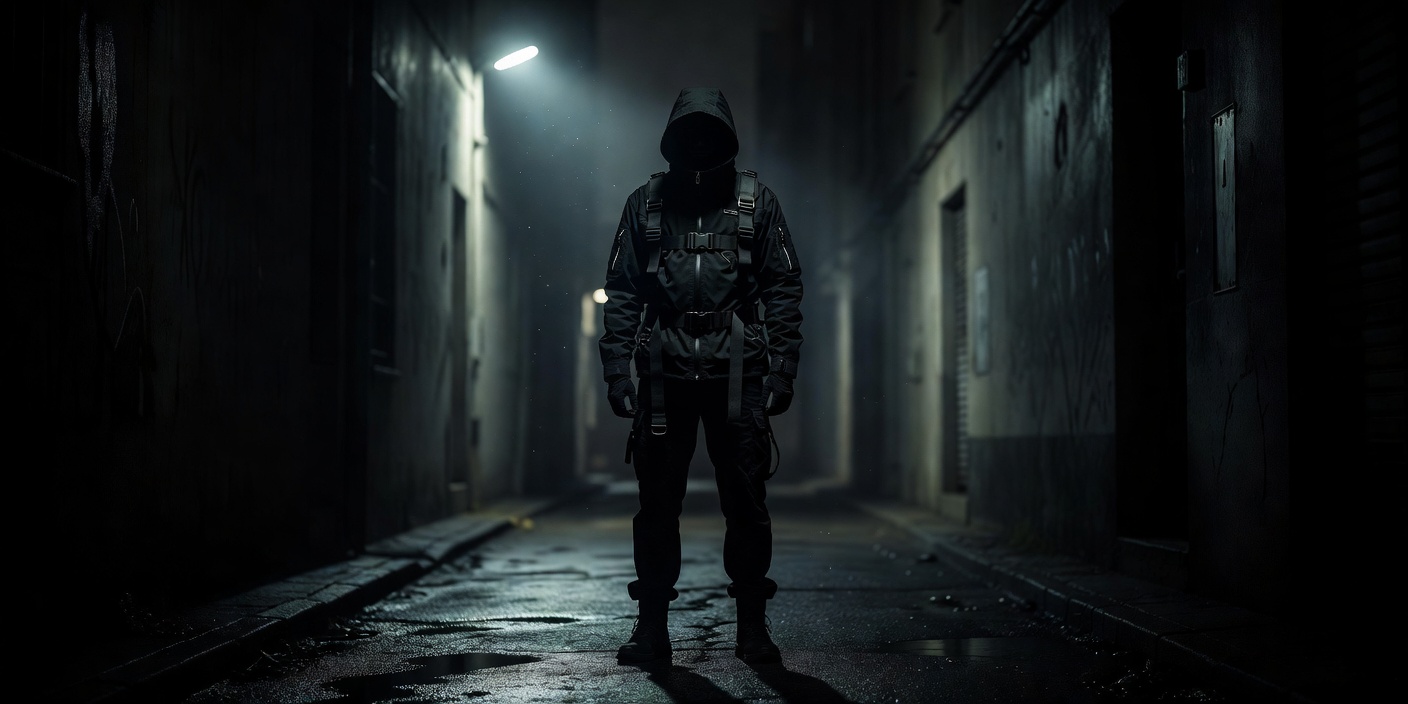
The clothing language reads as function claimed as style. Long protective outerwear, hoods and high collars, harnesses and modular pockets, technical fabrics, heavy boots, and eyewear that hides the eyes. Mirrorshades became the movement's badge because they do something specific: they refuse the reader access to the character's interior while reflecting the environment back at whoever looks. Sterling's anthology took its title from exactly that.
Around that core sit two clear influences: punk and its successors, contributing DIY modification, hardware, patches and asymmetric cuts; and workwear, contributing utility and repairability. Newer variants push towards head-to-toe technical outerwear and hardware-derived accessories. The through-line is that clothes look like equipment for a hostile city, and that visible modification signals independence.
Type and interface
Typography splits between two jobs. Public signage is loud, condensed and multilingual, stacked vertically as often as horizontally. Interfaces are monospace, wireframe and deliberately low-resolution, with scanlines, dot matrices and glow. The low-fidelity interface persisted long after real displays surpassed it because it reads instantly as machine and because visible pixels make a screen feel like a device rather than a window. Used well, interface design in this genre also carries plot: intrusion prompts, corrupted feeds and identity readouts tell you the state of the world without a line of dialogue.
Sound
The scores are as codified as the visuals. Vangelis's work on Blade Runner established the synthesiser-plus-reverb template — vast, slow, more ambient than melodic. Kenji Kawai took Ghost in the Shell somewhere else entirely with choral chant and percussion, and Geinoh Yamashirogumi's Akira score leans on gamelan-influenced percussion and voice rather than synths. Around the films, industrial and EBM supplied the aggressive end, and the later synthwave revival supplied the nostalgic one. If you want a rule of thumb: the score should sound like the building's ventilation as much as like music.
For where the imagery came from, see the screen guide; for what it is arguing, the themes guide.